The saga of graphs continues! Today is the 1st of the month, which is an exciting day for me; it’s the day that my finance management application spits out monthly reports, outlining fun things like “top variations in spending” and generating sweet graphs to show income vs. expenditure. It’s so wonderful when you can enter such simple information into a program and it shows you a thousand ways to look at it.
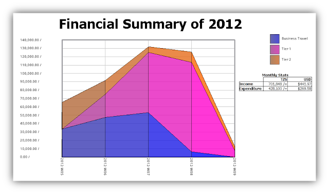
Much akin to how politicians sometimes release their tax returns during election season, I’ve decided to open a small window into the financial world of the Peace Corps Volunteer, albeit my status as an extendee on a USAID project skews the data a bit. Below is my financial summary for the month of February.
I included a small table to show the conversion between Tanzanian Shillings and United States Dollars, according to my application’s up-to-date currency stats. As you can see, I lived off of about $270 over one month.
As for the legend, I’ve split my costs into simple categories organized in tiers. Tier 1 includes all necessities, such as groceries, transport to the market, toiletries and household items, etc. Tier 2 is a catch-all for just about everything else, like nice meals out on the town, entertainment expenses (watching the Super Bowl, for example), and anything I’ve deemed not necessary for surviving in Tanzania. Business Travel is self-explanatory; all expenses incurred while on the road for my job. This is also the main reason why I’ve spent so much more than I normally do in a month. I usually only spend about half this amount.
So February is over, and it’s time to fill in Peace Corps’ annual Volunteer Allowance Survey! In the next few days, I’ll be parsing through these financial records to give Peace Corps accurate data on my monthly living expenses. And thanks to the power of open source software (Skrooge in particular), this should be a fairly easy task.

