Among the many, many small things I like to do when I’m not doing work is collecting data. Allow me to introduce the latest results of one of these ventures, while you consider what could possibly possess anyone to be so smitten with writing down numbers all day.
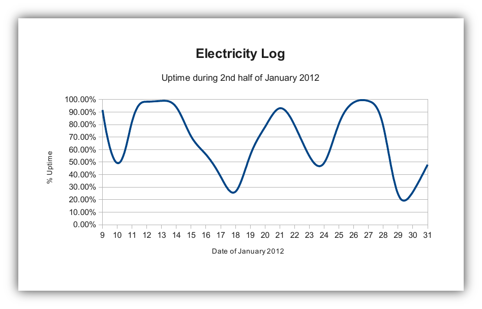
The fruit of my most recent labors is a graph of the electricity uptime in my town. For nearly an entire month, I kept track of the power cuts that occurred throughout the day. Given how much it happens around here, it was actually pretty difficult to keep the numbers accurate. I figured the resolution of the data wasn’t incredibly important; what’s more important is to show the general trend of the uptime, which you can see even with relatively inaccurate measurements.
Basically, I carried a sheet of paper around in my back pocket every day, and if the power cut or was restored, I wrote down the time it happened. From that, I was able to create a log of all the cuts and restorations, which allowed me to figure out how long the electricity was on every day.
But now the more important question: why, why on earth would I do something like this? Well, for one thing, there’s that whole home theater idea I had, which I was concerned would be a wasted effort after observing the first few days of power cuts in my new house. Then there was the oven I was considering, but hesitant to get because it depended on electricity. But I went ahead and bought that anyway (a bit impulsively I admit), despite the power situation here. To be completely truthful though, there has only been one or two occasions so far where I wanted to cook or bake something and wasn’t able to because of the power.
Anyway, as you can see in the graph, the electricity here sucks. It sucks real bad. There is no discernible pattern in how the power cuts; the only times you know it might go out is if there’s strong winds or it rains fairly hard. Inclement weather is nearly a guarantee that the power is going out. Which is a shame really, because our supply is local to Mtwara and is actually quite reliable. The unreliable part is the infrastructure to carry it.
Unfortunately, I was only able to collect data in January; I’ve spent most of my February so far in Mtwara town (with more trips on the horizon into mid-March), and then I’m going home in a month, making it all but impossible to keep collecting this data. Not that it would reveal much difference. I don’t expect the power situation to get any better. Not until they fix the power lines, at least. But it would’ve been neat to be able to look at all those numbers in graph form.
Hmm, what else can I graph…

